
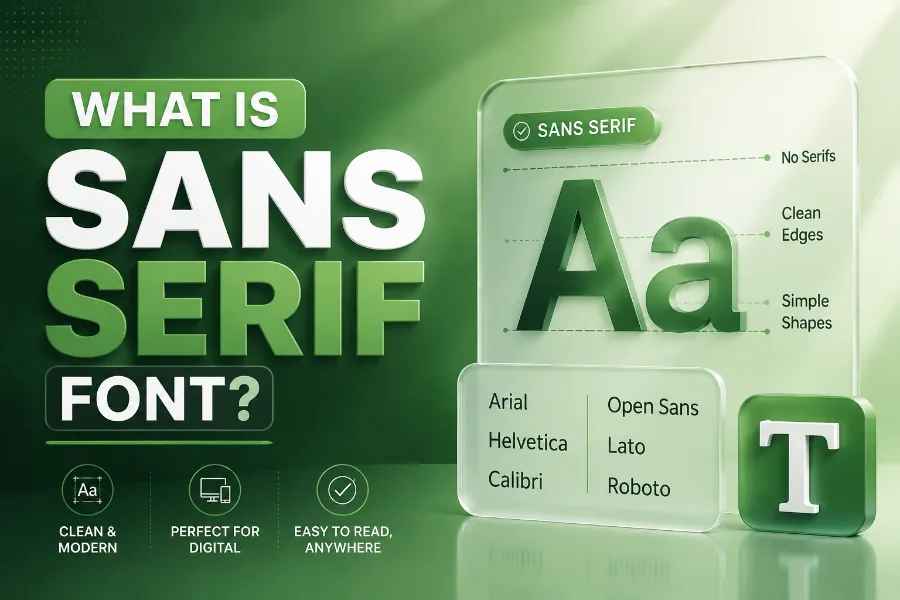
What is sans serif font is a common question when you start paying attention to why some text feels clean, modern, and easy to read while other text feels classic or formal. A sans-serif font is a typeface without the small finishing strokes, called serifs, that appear at the ends of letters in fonts such as Times New Roman or Georgia.
Because of this simple structure, sans-serif fonts often look sharp on screens, flexible in branding, and practical for websites, apps, logos, signs, and everyday digital communication. Read to learn more!
What Is Sans Serif Font In Simple Terms?
A sans-serif font is a font style that does not have tiny decorative strokes at the ends of its letters. The word “sans” means “without,” so the phrase simply means “without serifs,” but that small missing detail creates a big visual difference. When you look at a sans-serif typeface, the letters usually appear cleaner, smoother, and more direct than traditional serif fonts.
You see sans-serif fonts every day on websites, phone apps, social media platforms, software dashboards, product packaging, and street signs. Designers often choose them because they keep words clear even when the text is small, fast-moving, or displayed on a bright screen. When you want decorative text for usernames, captions, or visual posts, a tool that lets you produce premium copy-paste-ready font styles can help you experiment with different looks while keeping the main message easy to recognize.
The most important thing to remember is that sans-serif does not mean plain or boring. Some sans-serif fonts feel corporate and neutral, while others feel friendly, futuristic, elegant, playful, or bold. This makes them one of the most useful font categories for modern communication.
Why Sans Serif Fonts Became So Popular
Sans-serif fonts became popular because they matched the needs of modern design. As advertising, posters, public signs, computers, and mobile screens became more important, designers needed letterforms that could communicate quickly without extra decoration. A clean font helped people read at a glance, which mattered in busy streets, offices, stores, airports, and digital interfaces.
Their popularity also grew because modern brands wanted to look simple, efficient, and forward-thinking. Serif fonts often carry a traditional or editorial feeling, which can be perfect for books, law firms, universities, and newspapers. Sans-serif fonts, however, often feel more current, which is why many technology companies, startups, lifestyle brands, and software products rely on them.
Another reason is flexibility. Sans-serif families often include many weights, such as light, regular, medium, semibold, bold, and black, so you can build strong visual hierarchy without changing font families. This means one typeface can handle headlines, buttons, menus, captions, body copy, labels, and call-to-action text.
How Sans Serif Fonts Differ From Serif Fonts
The main difference between serif and sans-serif fonts is the presence or absence of small strokes at the ends of letters. Serif fonts have those finishing details, which can guide the eye across long printed text and create a more classic tone. Sans-serif fonts remove those details, giving the letters a simpler shape and a more modern appearance.
This difference affects how readers feel about your content. Serif fonts can feel established, serious, literary, or formal, while sans-serif fonts often feel clear, fresh, practical, and digital-friendly. If your brand depends on online content, you should think about type the same way you think about voice, and understanding how AI helps with online content creation can also show how modern tools support clearer writing, faster publishing, and better user experiences.
Neither style is automatically better. A serif font may work beautifully for a printed magazine, while a sans-serif font may perform better for a mobile app. The smartest choice depends on your audience, reading environment, brand tone, and the job the text needs to do.
Main Types Of Sans Serif Fonts
Sans-serif fonts are not one single style. They include several subcategories, and each one creates a different feeling even though all of them lack serifs. Knowing these groups helps you choose a font with more confidence instead of picking one only because it looks nice.
Grotesque sans-serif fonts are among the earliest sans-serif styles and often have a slightly industrial or vintage character. Neo-grotesque fonts are cleaner and more polished, which makes them popular for corporate design and neutral branding. Geometric sans-serif fonts use simple shapes like circles and straight lines, and reading about what is an AI writing assistant and how is it beneficial can also remind you that structure, clarity, and function matter in both writing systems and visual design.
Humanist sans-serif fonts feel warmer because they borrow some rhythm from handwriting and calligraphy. They usually have more natural letter shapes, which can make longer text feel less mechanical. If you want a brand to feel approachable rather than cold, a humanist sans-serif is often a smart place to start.
Why Sans Serif Fonts Work Well On Screens
Sans-serif fonts work well on screens because their shapes are clean and their details are easy to render at different sizes. On a phone, tablet, laptop, or large monitor, tiny decorative strokes can sometimes become blurry or crowded, especially in small text. A sans-serif font reduces that visual noise and helps readers understand words faster.
Screen reading is different from print reading. People often scan web pages instead of reading every sentence from top to bottom, so headings, menus, buttons, and labels must be clear immediately. Sans-serif fonts support this behavior because they create crisp lines, open spacing, and simple letterforms that are easier to process quickly.
This does not mean every sans-serif font is automatically good for a website. Some geometric fonts can look stylish but feel tiring in long paragraphs, while some condensed fonts can become hard to read on mobile screens. The best screen fonts balance personality with practical details like spacing, x-height, stroke contrast, and letter recognition.
Common Examples Of Sans Serif Fonts
Some of the most recognizable sans-serif fonts include Helvetica, Arial, Futura, Avenir, Roboto, Open Sans, Gotham, Gill Sans, and Frutiger. Helvetica is famous for its neutral and timeless appearance, while Futura is known for its geometric shapes and modern energy. Roboto and Open Sans are widely used in digital design because they remain readable across different screen sizes.
Each font has its own personality. Arial is familiar and practical, Avenir feels elegant and balanced, Gotham feels confident and architectural, and Frutiger was designed with strong legibility in mind. These differences matter because font choice can quietly change how readers judge your message.
A good example is a healthcare website compared with a fashion brand. The healthcare website may need a soft, trustworthy, highly readable sans-serif font, while the fashion brand may prefer something sharper and more distinctive. Both can use sans-serif typography, but they should not necessarily use the same typeface.
When You Should Use A Sans Serif Font
You should use a sans-serif font when clarity, speed, and modern presentation matter. It is often a strong choice for websites, mobile apps, software interfaces, presentations, resumes, online ads, social graphics, product labels, and business branding. The simpler shapes make it easier for readers to move through information without feeling distracted.
Sans-serif fonts are especially useful when your text must work across many devices. A headline may appear on a desktop hero section, a mobile search result, an email subject preview, and a social media card. A well-chosen sans-serif font keeps the message consistent in all of those places.
You should also consider sans-serif fonts when your brand wants to feel accessible. Many readers associate them with simplicity, speed, innovation, and direct communication. If your goal is to reduce friction and help people understand your message quickly, sans-serif typography is usually a safe and effective choice.
When Sans Serif Fonts May Not Be The Best Choice
Sans-serif fonts are useful, but they are not perfect for every situation. If you are designing a luxury editorial spread, a historical book cover, a formal invitation, or a traditional legal brand, a serif font may communicate more authority or elegance. The clean look of sans-serif typography can sometimes feel too modern for projects that need heritage, ceremony, or literary depth.
Some sans-serif fonts can also feel cold if you choose the wrong one. A very neutral neo-grotesque font may look professional, but it may not create enough warmth for a wellness brand, children’s product, or personal blog. In that case, a humanist sans-serif or a carefully paired serif may produce a better emotional result.
Readability can also suffer when the font is too thin, too condensed, or too stylized. A font that looks impressive in a large logo may fail in body text. Always test the typeface in real sizes before you commit to it.
How To Choose The Right Sans Serif Font
Start by asking what your text needs to achieve. If your goal is trust and clarity, choose a font with open letterforms, balanced spacing, and a calm personality. If your goal is energy and innovation, a geometric or bold sans-serif font may make the design feel more dynamic.
Next, think about where the font will appear. A typeface for a mobile app needs excellent readability at small sizes, while a typeface for a logo can have more personality. A website font must also load efficiently and include enough weights for headings, body copy, buttons, and captions.
Finally, match the font to your audience. A finance brand may need a stable and professional sans-serif, while a creative studio may choose something more expressive. Your font should not only look good to you; it should make the reader feel that the message belongs to the brand behind it.
How Sans Serif Fonts Shape Brand Personality
Fonts influence perception before readers fully process the words. A clean sans-serif font can make a brand feel organized, modern, and easy to trust. This is why typography is not just a design detail; it is part of how your audience decides whether your message feels credible.
A rounded sans-serif can make a brand feel friendly and casual. A sharp geometric sans-serif can make a brand feel innovative and high-performance. A humanist sans-serif can make digital text feel more natural, which is helpful when you want professionalism without sounding stiff.
The best brands use typography consistently. They choose a primary font, define sizes and weights, and apply them across websites, emails, ads, social posts, and documents. This consistency helps people recognize the brand faster and makes every touchpoint feel more polished.
Tips For Using Sans Serif Fonts In Web Design
Use sans-serif fonts with enough spacing so your text does not feel crowded. Line height, paragraph width, and font size all affect readability, especially on mobile screens. Even a beautiful font can fail if the layout forces readers to work too hard.
Create hierarchy with size and weight rather than using too many different fonts. For example, you can use one sans-serif family with bold headings, medium subheadings, and regular body text. This keeps the design clean while still helping readers understand what matters first.
Avoid using extremely thin fonts for important information. Thin letterforms can look elegant on large screens, but they may disappear on smaller devices or low-quality displays. For buttons, navigation, forms, and instructions, choose clarity over decoration.
How To Pair Sans Serif Fonts With Other Fonts
Sans-serif fonts pair well with serif fonts when you want contrast. A common approach is to use a serif font for headings and a sans-serif font for body text, or the reverse. This combination can make a page feel balanced because one font brings personality while the other brings clarity.
You can also pair two sans-serif fonts, but you need enough contrast between them. For example, a geometric sans-serif heading can work with a humanist sans-serif body font. If the two fonts look too similar, the pairing may feel accidental rather than intentional.
Keep your font system simple. Most websites only need one or two typefaces, plus a few carefully chosen weights. Too many fonts can make a design feel messy, slow, and less professional.
Mistakes To Avoid With Sans Serif Fonts
One common mistake is choosing a font only because it is popular. Helvetica, Roboto, Futura, and Open Sans are strong options, but they are not automatically right for every brand. A font should support your message, not simply follow a trend.
Another mistake is ignoring accessibility. Text needs enough contrast, reasonable size, proper spacing, and clear letter shapes so more people can read it comfortably. If users must zoom in, squint, or reread basic instructions, the typography is not doing its job.
You should also avoid using too many weights without a clear system. Bold, semibold, medium, regular, and light styles can help create hierarchy, but they can also create clutter when used randomly. Choose a few roles for each weight and apply them consistently.
Conclusion
What is sans serif font is more than a definition; it is a practical design question about clarity, tone, usability, and how people experience your message. A sans-serif font removes decorative strokes to create cleaner letterforms, but the best choices still carry personality, structure, and purpose.
You can use sans-serif typography for websites, apps, logos, social content, presentations, and brand systems when you want text to feel modern and easy to read. The key is to choose a font that fits your audience, test it in real layouts, and make sure it supports the message instead of distracting from it. When used well, sans-serif fonts help your content look polished, readable, and ready for the way people consume information today.